Examples of good UX
Some nice examples of helpful UX
Last updated on December 16th, 2022
The web is littered with features that do that little bit extra to provide a great user experience. Over time we get used to these features and expect to see them as standard on all the websites we visit. Here are some of the emerging trends that have caught my eye.
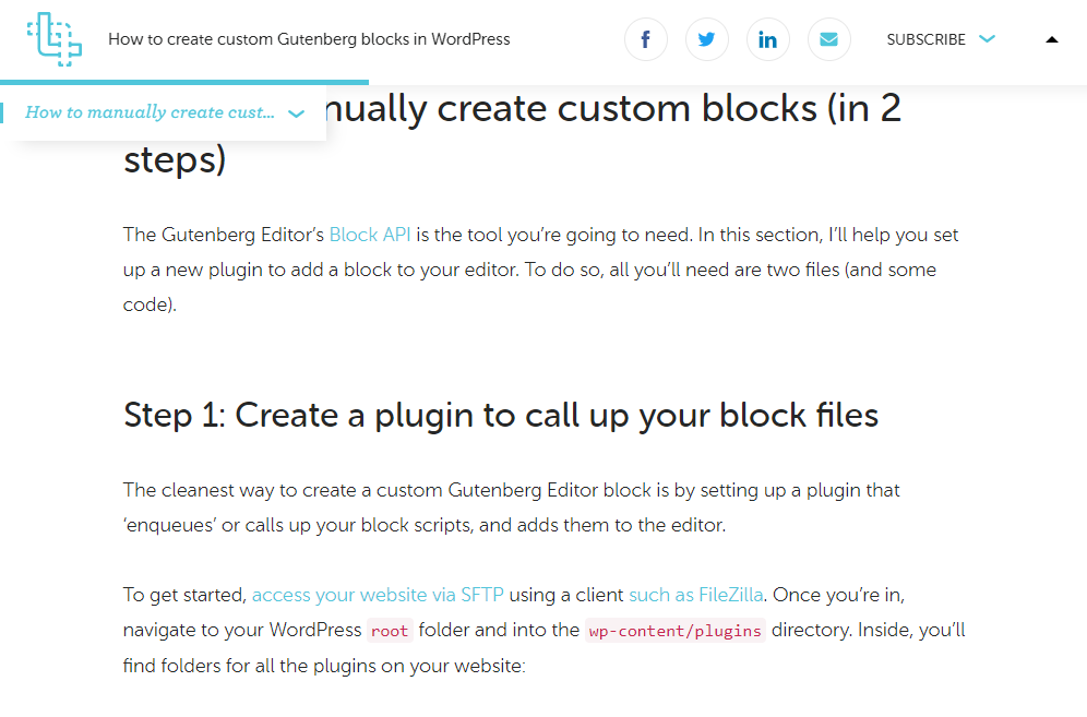
Reading position indicator
A reading position indicator can show a user how far they are through reading an article on a website. An example is on the CSS Tricks website.
Form with hint text
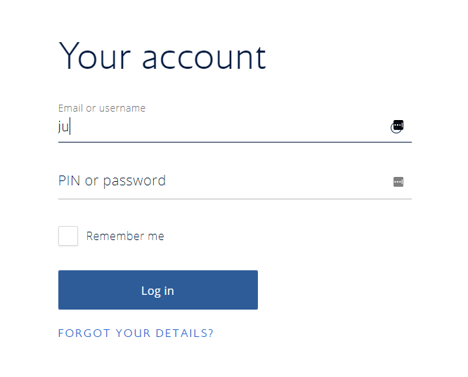
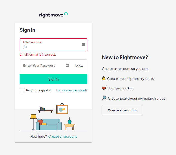
Input fields that have hint text that stays in the field so that it is always present when the user is typing in the field. An example is on the Get Bootstrap website and on the British Airways website.
Skip Navigation
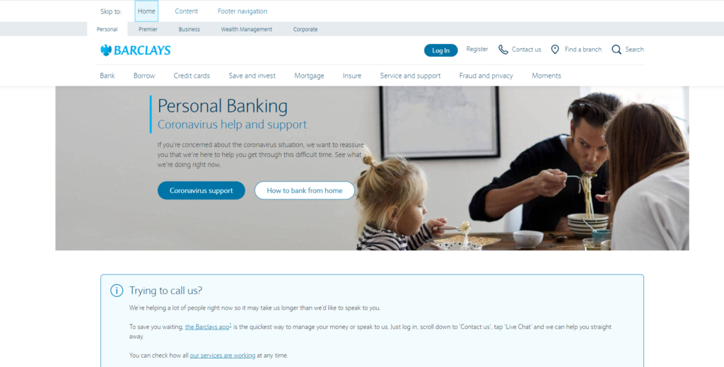
For users who chose or need to use keyboard controls ‘skip navigation’ allows them to jump straight to the content rather than tabbing through every menu item. Barclays has gone one step further and allowed the user three choices; Home, Content or Footer.
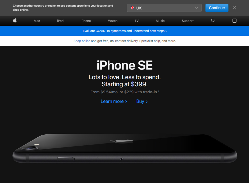
Select Country
For companies that have multiple individual country websites and a global .com website, they may occassionally need to redirect users based on thier location. Apple do a nice job of redirecting a user to the most appropriate country retail website.
